
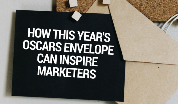
Last year, I wrote about the Oscar’s Best Picture debacle and what marketers could learn from it when thinking about communicating information in print or in digital: add signals of importance (like bold or italics), make it easy to interpret, give readers room with white space, and use the inverted pyramid of importance to convey information. While we don’t know if the card inside the envelope was any easier to read this year, we do know that the envelope itself was considerably easier to read, making it harder for the original error in last year’s crisis to be repeated—Warren Beatty and Faye Dunaway were given the wrong envelope for the category they were presenting.
This year, let’s talk about how the newly designed envelope, in addition to the new PwC rules, helped alleviate the worry of a blunder and how you can implement the same principles to your marketing materials, whether digital or print.
Use High Contrast
 Last year’s envelope was branded very well. It used the Oscar colors—a deep red and a gold—and looked very classy. While red and gold can go well together, especially when used with another color—like a white or black—to highlight the differences, gold on red is actually fairly difficult to read.
This year’s envelope, however, opted for high contrast colors that were still on-brand: a dark gray with a silver or off-white text. These colors paired together are instantly better to read. That’s because elements that are high contrast—a great difference between the color or object in the foreground and the color or object in the background—is attractive to the eye and grabs attention. The light and the dark make it easier for the eye to distinguish between the two colors, making it easier to see and in turn comprehend.
When designing your marketing materials, make sure to test the readability of the text. Are you using high contrast colors? Is there anything in the background that will distract from the text in the foreground? Is it easy to comprehend the important information at a quick glance? If you look at the test image on the right, the left side is easier to understand at a quick glance than the right, which requires a little more concentration to understand what words are there.
To learn more about contrast, check out Canva’s primer or learn from the people fighting low-contrast text.
Consider Type Size and Weight
Not only did last year’s envelope use colors that were not high contrast and so were hard to read, last year’s envelope also used a small font size and a light font weight, which added to the difficulty. Looking at this year’s envelope, there were three font sizes and three font weights used. It sounds like that would be confusing, but it actually made things easier to comprehend.
The first category listing was front and center on the envelope, roughly in the same place as last year’s category listing. This year utilized a slightly heavier font weight, but closely the same size; readable from a close distance. The second category listing was also on the front of the envelope, but in a much larger size and a much heavier weight and usually spread over the top left corner and the bottom right corner of the envelope; considerably easier to read from a distance—you could even read it from your couch at home. Hopefully this alone could have eased the confusion. But just to make sure, there was a third listing, on the back of the envelope. It’s size and weight somewhere in the middle of the two listings on the front and the last line of defense to the presenters, who would see it right before they opened the envelope to announce the winners.
Using too many different sizes, weights, or types of fonts in one area can be overwhelming, especially in print on a direct mailer or handout. But using different weights and/or sizes of fonts to signify importance of information is key. Having an address to an event be in a large and heavy font isn’t likely to get a turnout if the event title itself is lost in a smaller size. Determine what kind of font sizes and weights look best for the message you’re trying to convey and the mode of communication.
Repeat Yourself
As far as I can tell from pictures from 2017’s ceremony, there was only one label on the Oscars envelopes, which was on the front. This year’s envelope repeated the category three times: once in the middle, centered; once in larger, heavier letters on the front; and once on the back flap of the envelope. It gives the presenter—and those backstage—three ways to check they have the correct envelope for the category they’re presenting.
While it might not always be practical to repeat information so many times on a website or other marketing material, it is important to make critical information readily available to those who need it, when they need it. If many consumers or customers call your company, make sure the telephone number is in the header and footer of your website. If your call to action is to donate, make sure there’s at least one button above the fold on the homepage, in addition to being featured in relevant places throughout the site.
Be Stylish
Architect Louis Sullivan is credited with the phrase, “form follows function,” where function is the use of the item being designed—in this case, Oscar envelopes—and form is the design of the item. Last year, arguably, function followed form. This year, I’m sure a lot of conversation centered around how to make the envelopes more functional, to not repeat last year’s flub. But these envelopes didn’t disregard form, either.
This year’s envelope design shows that you can have both form and function, which corresponds to another architect’s response to Sullivan’s quote; Frank Lloyd Wright wrote, “‘Form follows function’ is mere dogma until you realize the higher truth that form and function are one.” As you’re developing marketing materials, realize that they need to both communicate information and look good doing it.
Need help? Let’s talk design.