I love the Oscars: I have Best Picture-themed food the night they air, I fill out ballots, I watch all the red carpet coverage, I wait for the opening scene—it’s the closest to the Old Hollywood glamour we have nowadays.
So when the snafu happened at the end of last Sunday night’s event, I was intrigued. While there’s a lot to be said about what happened, let’s talk about that winner card—and what marketers in all industries can learn from something so simple.
To refresh your memory: when one of the producers of La La Land wanted to prove to the cast, crew, and fans of Moonlight that he wasn’t joking, he took the correct winner’s card from Warren Beatty, turned it around, and showed it to the audience and the camera. And just like when Steve Harvey had his Miss Universe gaffe, the card has been mercilessly Photoshopped and turned into numerous memes.
One user on Medium uses Photoshop for good and pleads his case that the winner’s card could have been better designed—or at least should be next year. His argument is that the mix-up was avoidable if the designers of the card had thought through how the presenters would read the card (from top to bottom) and use font size to accentuate importance of category and winner’s name.
What’s This Have to Do with Me?
Oscar winner cards are read by a vast array of people in a potentially tense situation with lots of people waiting for the results. It would make sense that a winner card would be designed to reduce the potential for mistakes. The “re-designed” card accounts for a quick perusing and immediate understanding of the information presented.
Your audience might not be reading your website or other marketing information under a tense situation with seconds to go before making a huge announcement, but you should still want to present your information and content to be as easily comprehended as possible. Here are some ways to make sure that your marketing materials come across as clear as possible.
Add Signals of Importance
In spoken words, it’s often easier to tell when someone is trying to emphasize words or introducing a new topic, but in writing the intention has to be much more explicit for the meaning to come across to the reader. That’s why bold and italic text exist, to convey importance or differentiation of some kind. Size and color of words can also convey meaning, but one of the easiest signals of importance is headers.
A header is used to separate different sections of a long article or blog post, usually with larger and/or bolder text. In the same way that you would outline a long written document or plan out a presentation, website header tags outline content on a page. Consistent use of H (header) tags throughout a website allows for readers to easily glance at the page, get a gist of the content, and read what where to buy antibiotics for chickens they are most interested in, whether it’s an entire web page or simply a section of blog post that’s most pertinent to them.
Be Easy to Interpret
Marketing materials, like a winner card, need to be easy to interpret at a quick glance. With the attention span below eight seconds, it’s important that a website, direct mail flier, or email catch and retain the attention of a prospect. To do that, the brain needs to understand what it’s looking at. Images and video are easier for the brain to interpret than text, so using images to reinforce the points that are in the text is beneficial.
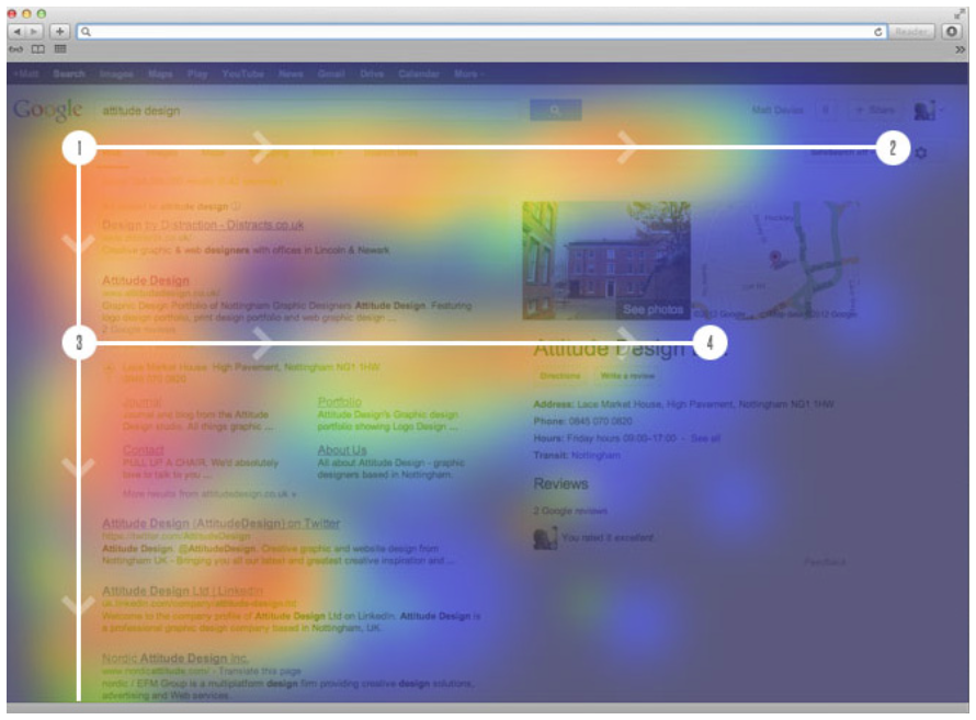
 Many studies have shown that website users read content in an F-shaped pattern. Understanding that, put important elements—like the website menu, company mission statement, or calls to action—at the top or left hand side of the page. When users don’t have to search very hard for what they’re looking for, the more likely they are to stay on your site and spend more time on the pages that are more relevant to them.
Give Readers Room with White Space
Do you ever look at a piece of writing and feel overwhelmed? It could be that there’s too much text on the page or the text is too small, but one thing that’s probably missing is white space. White space is the blank space around text. It allows your eyes and brain some space to comprehend the rest of the information on the page.
White space is a designer’s friend. It can be used to visually separate ideas, to create suspense by acting as a pause for users to scroll down the website for a big reveal, to just give a breather in a crowded space. Too much, though, can make it seem like there’s nothing on the page worth noting.
Use the Inverted Pyramid
When you’re telling a story, it’s good to use Freytag’s Pyramid as a structure. When trying to convey more educational or informational content, using the journalistic inverted pyramid is better. Whereas a story leads to an important takeaway at the end, the inverted pyramid starts with the most important element and continues to layout minor details in subsequent paragraphs.
Using the inverted pyramid when writing website or marketing content lets the reader get right to the point. If you bury the lede, users will feel like they’re on a wild goose chase or like your company is hiding something, and they’ll leave before they find what they’re looking for.
Learn from the Oscars’ mistake and prepare your website and marketing materials with the reader in mind. Use subtle signals in the text to give levels of importance, understand how your reader sees your website and where they’re looking, give them space to take in the information, and give them the most important information first.
Need help implementing these tips? Contact us today to talk to our web design team about your website.
{{cta(‘1b58025a-e81f-4ce5-9d94-308b09d18d20’)}}
