
.png)
Baseball is back! Today was supposed to be the opening day for Wrigley Field, but with the snow that fell this morning in Chicago, the Cubs decided to postpone the game, while the White Sox found a pretty ingenious way of dealing with the snow on their field to still play their home opener.
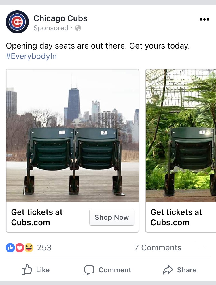
As the Cubs were prepping for Opening Day, I’m sure they wanted to get as many people as possible in the stands. In the days leading up April 9, I came across Facebook ads in my feed reminding me that Opening Day tickets were still available.
The ads themselves are simple: nine words, the Cubs hashtag for the year, and a couple of photos with stadium seats. But there’s so much communicated in such a simple ad that it should act as the template for your future social ads.
Let’s start with the image.
As someone scrolls down their feed, the seats are probably what’s going to catch their attention. There’s an instant connection for anyone from the city of Chicago (or, at the very least, the North Side) with those green seats—you know exactly where they’re from: Wrigley Field.
One is the loneliest number, so two seats conveys a sense of community or camaraderie or relationship—you’re going to want to share this experience of watching the Cubs with someone else. It works great for the Cubs, too, to upsell from one ticket to two.
Then, instead of having the seats among the many in the ballpark, these two are out and about in the city and it works for the ad in several different ways: It serves to remind the audience—as if that’s necessary—that the Cubs are a Chicago team. It also creates an inconsistency for the brain—Wrigley Field seats outside of Wrigley Field—which will grab the audience’s attention while they’re scrolling down their feed and make them stop and look at the ad to reconcile what they’re seeing. Having the seats in various parts of the city also communicates that these seats are for everyone and that they’re within easy reach (even if the reality of the prices say otherwise).
Next, the text.
Now that the user has stopped on the ad and have processed the image, the nine words of the ad communicate with simplicity. There’s no mention of the team name, because the creator knew the logo and Facebook Page name would be displayed above the ad, so there’s no need to be repetitive. It doesn’t mention the specific date of Opening Day—if a person clicks on the ad and finds they’re not available on April 9, maybe they’d like to buy tickets for another game.
“Are out there” is another way of saying “are available.” But by mixing up the phrasing just bit makes it seem like it’s not as salesy as the standard phrasing we’re all used to. The way it’s phrased also connects with the image—the idea that the seats really are out there in the city, for everyone.
“Get yours today” is given in the imperative (a command), meaning it’s literally telling the audience what to do, but it’s subtle about it. Since there were only six words preceding this call to action, there’s no need to repeat what I’m supposed to be getting. I remember just fine: Opening Day seats.
Then the hashtag
The #EverybodyIn hashtag is a part of the bigger Cubs marketing strategy for the year. They’re using it in almost every post on social, at the end of videos, and probably in TV and print ads. It not only conveys that everyone on the team is “in”—ready to get down to business for the season, ready to work together toward another Word Series win—it brings the fans together, too. And not just fans from Chicago, but everywhere: the Cubs have a far reach not only across the nation, but internationally as well.
The hashtag also reinforces the idea that the image presented that the tickets are for everyone. And while Wrigley is an expensive venue, the Cubs are offering 10/Sixty tickets this year—a raffle for every home game of sixty tickets that will sell for $10 each. I’m pretty sure those will bring everybody in.
Lastly, the CTA
The last part of the ad is the call to action, or the CTA. It’s the whole point of the ad—the link to the ticket sales page. If you notice, up until now, no direct mention has been made of tickets in the ad, the exact thing the Cubs want you to purchase. In keeping the ad simple, tight, and to-the-point, the audience knows exactly what the ad is for without having to be explicit or repeating the word “ticket” ad nauseam. By having the word at the bottom of the ad, in the link to the page, it makes it obvious where to go to buy tickets without being heavy handed.
The CTA also tells the audience exactly where the link is going to take the user (“Cubs.com”) and what to do when they get there (“Get tickets”, “Shop Now”) using those commanding verbs.
What does that mean for you?
This ad should be a template for you and your company as you consider social ads, and specifically Facebook ads:
- Know how the image will communicate to your intended audience
I’m not sure if this ad was targeted to people in a geographic location (the North Side of Chicago) or to people who “liked” baseball or only to those who follow the Chicago Cubs Facebook page, but as someone who has grown up around baseball and the Cubs, I know immediately what those green seats are and who the ad was for.
The image should be able to grab your audience’s attention, communicate the purpose of the ad, and connect with the text of the ad. If it’s not easily interpreted by your audience, it’s not going to keep their attention and the rest of the ad won’t matter, as they’ll scroll past it.
- Keep the text simple
The Cubs created a simple, direct ad with only nine words. While it might not always be possible to keep an ad that tight, your ads should use simple words that best communicate your idea. No long sentences or complicated words or paragraphs of information.
- Be on brand
The Cubs used the hashtag that’s a part of their larger marketing strategy and brand feel. While your company might not use hashtags, make sure that the ads you’re creating follow any brand guidelines you might have and the tone and voice of the company. You want to keep a consistent experience for the audience to build up trust and a connection between them and your company.
- Know your goal
When creating a social ad, you’ll have to be specific with what goal you want your audience to accomplish, whether that’s filling out a demo request or a lead generation form or purchasing a product. Everything in the ad should be funneling down to that goal, making it the only logical next step. If there’s too much inconsistency or no direct objective, the ad will fall flat and you won’t be able to see the returns you planned for.
- Don’t be repetitive
As I mentioned, this Cubs ad did a pretty good job of not repeating itself. Don’t hit your audience over the head with your product name or command verbs. The excess will only cause them to keep scrolling down their feed, further away from your ad.
As baseball season begins, make sure your ad campaigns are as simple and straightforward as this ad was. It doesn’t take a lot to create a truly effective ad, so use this ad as a template for social ads this quarter.
If you need help putting together a social media strategy, Sparkfactor can help!
{{cta(‘b89bda7a-91a9-4545-ada0-f0bb7ef551ed’)}}